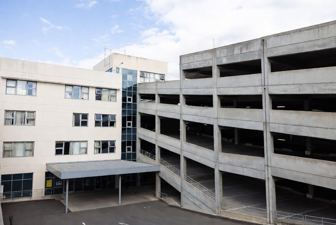
Stand at a parking kiosk in any major North American city and watch people interact with it. Within ten minutes, you will see at least one person walk away in frustration. Someone will tap the screen repeatedly in the wrong place. A tourist will stare at English-only instructions they cannot read. A person in a wheelchair will strain to reach a screen mounted six inches too high. And at least one driver will abandon the process entirely and take their chances with a parking ticket rather than wrestle with the machine.
This is not a technology problem. Modern parking kiosks are capable machines — processing credit card transactions, printing receipts, communicating with enforcement systems, and operating in brutal weather conditions. The hardware works. What fails, more often than operators realize, is the user experience.
The Cost of Bad UX
Poor user experience at parking kiosks has real financial consequences that extend well beyond frustrated customers. Every transaction that fails because a parker cannot figure out the interface is lost revenue. Every customer who gives up and leaves represents a complaint that may never be voiced but absolutely shapes their perception of the parking operation, the surrounding businesses, and the municipality.
Studies from parking operations in several U.S. cities have found that user-interface-related transaction failures account for 5 to 15 percent of all kiosk interactions, depending on the population served and the complexity of the rate structure. For a busy downtown kiosk processing 200 transactions per day at an average of $8 per transaction, even a 10% failure rate translates to $160 in daily lost revenue — nearly $60,000 per year from a single kiosk.
Beyond direct revenue loss, poor kiosk UX creates downstream operational costs. Confused parkers call customer service lines. Enforcement officers spend time dealing with parkers who claim they tried to pay but could not. And municipalities face political pushback when residents perceive parking technology as user-hostile.
The Compliance Factor
There is a subtler cost as well. Parking operations that rely on kiosks for revenue depend on voluntary compliance. Unlike gated facilities where a driver physically cannot leave without paying, on-street kiosk systems rely on the assumption that most people will attempt to pay. When the kiosk experience is frustrating, the psychological threshold for non-compliance drops. A parker who tried to pay and failed feels justified in walking away. A parker who sees a line of confused people at the kiosk may not even attempt payment.
Good user experience, then, is not just a nice-to-have feature for parking kiosks. It is a revenue driver and a compliance tool.
Principles of Good Kiosk UX
Effective parking kiosk design follows principles that are well-established in the broader field of user experience design but have been slow to reach the parking industry. Here are the ones that matter most.
Minimize Decision Points
Every screen, every button, and every decision point in a kiosk interaction is an opportunity for confusion. The best kiosk interfaces ruthlessly minimize the number of steps between approaching the machine and completing payment.
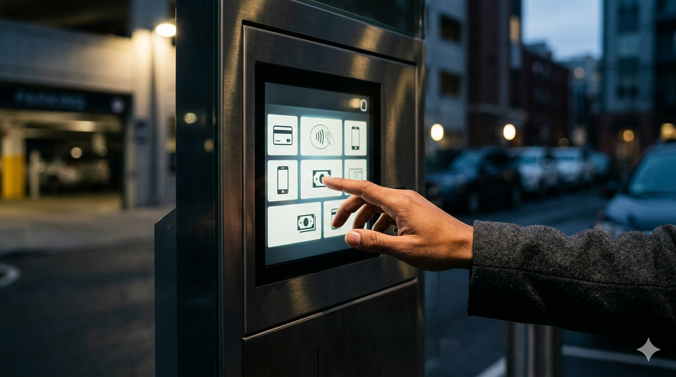
The ideal transaction flow looks something like this: select your space or zone, choose your duration, insert payment, take your receipt. Four steps. Some kiosks stretch this into eight or ten steps with unnecessary confirmation screens, rate displays, and option selections that serve the operator’s information needs rather than the parker’s workflow.
Manufacturers who prioritize user experience — companies like Parking BOXX — have moved toward streamlined interfaces that eliminate unnecessary decision points while still providing the flexibility that operators need. The principle is straightforward: every additional screen in the transaction flow reduces completion rates.
Visual Hierarchy and Clarity
Kiosk screens need to communicate clearly in challenging conditions — direct sunlight, rain, darkness, and the time pressure that parkers feel when they are trying to get somewhere. Effective visual design for parking kiosks prioritizes high contrast, large text, clear iconography, and obvious call-to-action buttons.
Color coding helps enormously. Green for action buttons, red for cancel, consistent color associations throughout the interface. Users should never have to read fine print to understand what a button does. The visual language should be so clear that a first-time user can navigate the interface through shape, color, and position alone.
Font size is a constant source of friction in kiosk design. What looks perfectly readable on a designer’s monitor at arm’s length becomes illegible on a sunlit kiosk screen viewed from a distance. Effective kiosk UX accounts for real-world viewing conditions — older users with declining vision, screens partially obscured by sun glare, and the fact that many users will be looking at the screen from an angle rather than straight on.
Feedback and Confirmation
Users need to know that the system has registered their actions. Tap a button and nothing happens for two seconds? Most people will tap it again, potentially triggering unintended actions. Insert a credit card and see no acknowledgment? Many users will remove and reinsert the card, causing transaction failures.
Good kiosk UX provides immediate feedback for every user action — visual confirmation of button presses, clear progress indicators during payment processing, and unambiguous success or failure messages. Audio feedback can reinforce visual cues, particularly for users who may not be looking directly at the screen while inserting payment.
Error handling is where many kiosk interfaces fall apart completely. A generic error message that reads “Transaction Failed” tells the user nothing actionable. Was it the credit card? The network? A timeout? Effective error messages explain what went wrong in plain language and tell the user what to do next.
Forgiveness in Design
People make mistakes, especially when they are rushing. A well-designed kiosk interface makes it easy to recover from errors without starting over. Back buttons should be prominent and available on every screen. Accidental selections should be reversible. And the system should never put the user in a state where the only option is to walk away and start a new transaction.
Time-based sessions are a particular pain point. Kiosks that time out after 30 seconds of inactivity and reset to the home screen infuriate users who paused to pull out their wallet or answer a phone call. Generous timeouts with clear countdown warnings are a small design choice that makes a big difference in user satisfaction.
Accessibility: Not Optional
Parking kiosk accessibility is both a legal requirement and a moral imperative, yet it remains one of the most neglected aspects of kiosk design. The Americans with Disabilities Act and equivalent Canadian regulations establish clear standards for self-service kiosks, but compliance levels across the parking industry are uneven at best.
Physical Accessibility
ADA guidelines specify reach ranges, operable part requirements, and clear floor space dimensions for self-service kiosks. A person in a wheelchair needs to be able to reach the screen, the card reader, and the coin slot without assistance. This means screens and input devices must be mounted within the specified reach ranges, and the ground surface in front of the kiosk must provide adequate maneuvering space.
Knee clearance beneath the kiosk is often overlooked. Wheelchair users need to be able to get close enough to the screen to interact with it comfortably, which requires space beneath the machine that many kiosk designs do not provide.
Button and touchscreen sensitivity also matters for users with limited hand dexterity. Touchscreens that require precise finger placement or firm pressure are difficult for users with motor impairments. Large touch targets with generous spacing between interactive elements improve usability for everyone but are essential for users with limited fine motor control.
Visual Accessibility
Kiosk interfaces need to be usable by people with a wide range of visual abilities. High contrast displays, large fonts, and the avoidance of color as the sole means of conveying information are baseline requirements. Some advanced kiosk systems offer adjustable text size or high-contrast modes that users can activate.
Screen glare is a visual accessibility issue that gets inadequate attention. Anti-glare coatings and screen hoods can make the difference between a usable and unusable kiosk for someone with low vision. The screen angle relative to typical sunlight paths at the installation location should be considered during site planning.
Audio and Tactile Accessibility
For users who are blind or have significant visual impairments, audio guidance is essential for kiosk usability. Text-to-speech functionality, combined with tactile wayfinding to locate the audio jack or speaker, enables independent use. Raised lettering or braille on physical buttons provides additional tactile navigation cues.
The parking industry has been slower to adopt audio accessibility features than other sectors like banking ATMs or transit ticketing. But as municipalities face increasing scrutiny around ADA compliance and as advocacy organizations push for inclusive design, audio-accessible parking kiosks are becoming a procurement requirement in many jurisdictions.
Multilingual Support
North American cities are multilingual environments, and parking kiosks serve everyone who drives — regardless of their primary language. Effective multilingual support goes beyond simply translating the English interface into Spanish or French.
Translation Quality
Machine-translated kiosk interfaces are immediately recognizable and often confusing. Parking terminology does not always translate directly, and awkward phrasing can turn a simple transaction into a puzzle. Professional translation by native speakers familiar with local usage is essential. The French used in Montreal differs from the French used in Paris, and the Spanish spoken in Miami differs from the Spanish of Mexico City.
Language Selection Design
How users select their language matters. A small flag icon in the corner of the screen is easy to miss. A prominent language selection on the home screen adds a step for English speakers but dramatically improves accessibility for everyone else. Some kiosks allow language selection at any point during the transaction, which is ideal — a user who started in English and realized halfway through that they would prefer Spanish should be able to switch without restarting.
Beyond the Big Two
In many North American cities, English and Spanish (or English and French in Canada) are just the starting point. Kiosks in neighborhoods with significant populations of Mandarin, Korean, Vietnamese, Arabic, or Tagalog speakers may need additional language options to serve their communities effectively. The decision about which languages to support should be data-driven, based on the demographics of the area the kiosk serves.
Environmental Considerations
Parking kiosks operate in some of the most challenging conditions any user interface faces. Designing for these conditions is part of designing for good user experience.
Sunlight and Readability
Direct sunlight can render a standard LCD screen completely unreadable. High-brightness displays, transflective screen technology, and physical sun shades all address this problem, but they add cost. The temptation to save money with standard displays is strong, but a kiosk that cannot be read in sunlight is a kiosk that fails its users for several hours every day.
Gloves and Touch Sensitivity
In cold climates, users interact with touchscreens while wearing gloves. Capacitive touchscreens that require direct skin contact are a frustration source from November through March across much of North America. Kiosks designed for outdoor use in cold climates need touchscreen technology that works through gloves, or they need physical buttons as an alternative input method.
Rain and Snow
Water on a touchscreen creates phantom inputs and unresponsive areas. Effective kiosk design includes rain protection — recessed screens, overhangs, or hydrophobic coatings that help shed water. The physical design of the kiosk housing should direct water away from the screen and input devices rather than channeling it toward them.
The Role of Testing
Good kiosk user experience does not emerge from design documents and specification sheets. It comes from watching real people use real machines in real conditions. Yet usability testing is one of the most frequently skipped steps in parking kiosk development and deployment.
Pre-Deployment Testing
Before a kiosk design is finalized, it should be tested with representative users — including elderly parkers, people with disabilities, non-English speakers, and people who have never used a parking kiosk before. This testing reveals usability problems that designers and engineers, who are deeply familiar with the system, cannot see from the inside.
Task completion rates, time to complete a transaction, and error rates are all measurable metrics that should meet defined thresholds before a kiosk design moves to production.
Post-Deployment Monitoring
Once kiosks are in the field, operators should monitor transaction completion rates, abandoned transactions, and customer service calls related to kiosk usability. Dips in completion rates may indicate seasonal factors (glove season affecting touchscreen usability), software update regressions, or hardware degradation.
Some modern kiosk platforms include analytics that track user paths through the interface, identifying screens where users hesitate, tap incorrectly, or abandon transactions. This data is invaluable for iterative UX improvements.
Looking Forward
The parking kiosk user experience is improving, driven by competitive pressure among manufacturers, rising expectations from operators and municipalities, and a general cultural shift toward user-centered design. The National Parking Association has recognized user experience as a priority area for the industry. Several trends are worth watching.
Mobile payment integration is reducing the number of transactions that happen at the kiosk at all, which paradoxically may improve kiosk UX. As tech-savvy users shift to mobile payment, the people who continue to use kiosks are increasingly those who most need a simple, accessible interface — older adults, visitors, and people without smartphones.
License plate recognition systems that eliminate the need for the parker to enter a space number or display a receipt remove one of the most confusing steps in the kiosk transaction. When the system already knows which car is parked where, the kiosk interaction can be dramatically simplified.
And the broader trend toward more intuitive interfaces is pushing manufacturers to explore voice-controlled kiosks, gesture-based interactions, and mobile-to-kiosk connectivity that keeps the transaction on the user’s own device.
Through all of these changes, the fundamental principle remains the same. The parking kiosk is, for many people, the face of the parking operation. When it works well, it is invisible — a two-minute transaction that barely registers. When it works poorly, it is a source of frustration, lost revenue, and eroded trust. Getting the user experience right is not just good design. It is good business.